
Core payments
Redesigning Yaspa's core payment flows
Year
2026
Duration
12 weeks
Role
Lead product designer
The problem
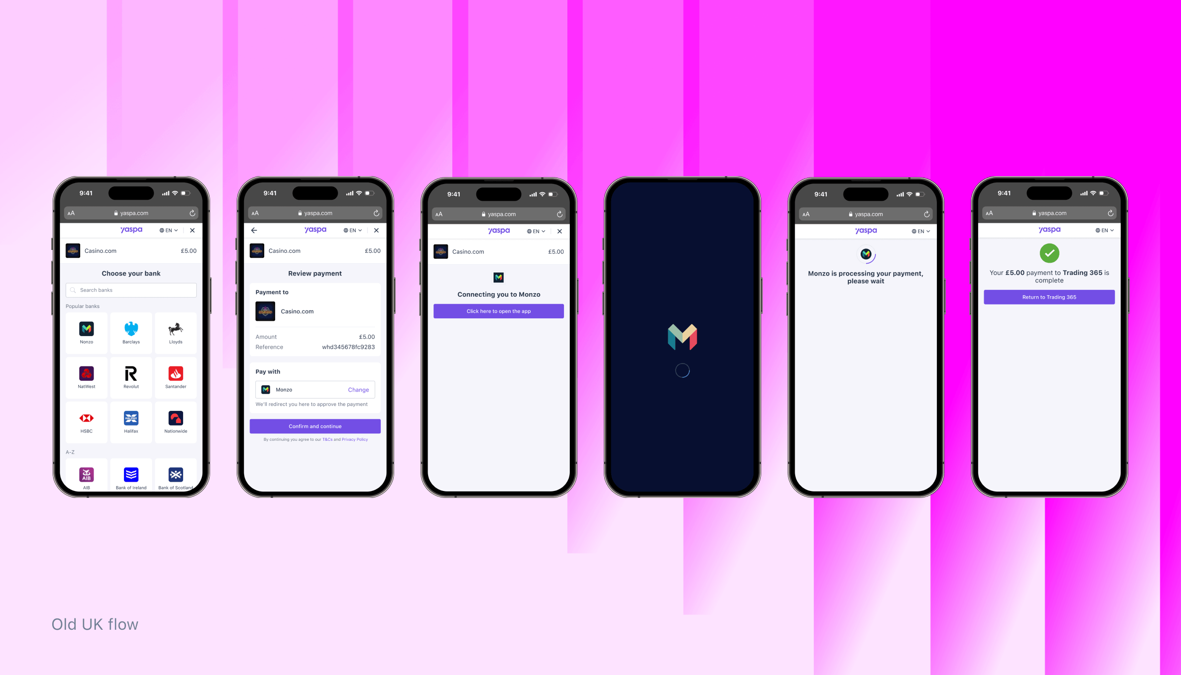
The payment flows hadn't been meaningfully updated in 4 years and competitor analysis and audit of the Yaspa journeys surfaced three issues beyond an ageing look.
1. Repeated information. On a first-time journey, the Review payment screen restated details the user had already seen, adding visual clutter at the moment we needed them focused.
2. A redundant step. A standalone "Connecting you to your bank" screen asked users to tap again before redirecting. It added nothing, and every extra tap in a payment flow is a small conversion loss.
3. A static interface. Nothing in the experience felt responsive or considered, which matters when you're asking someone to trust you with a payment.
This gave me a clear goal: make the flow shorter and more intentional with its screen space, without losing the information users rely on.
Competitor analysis
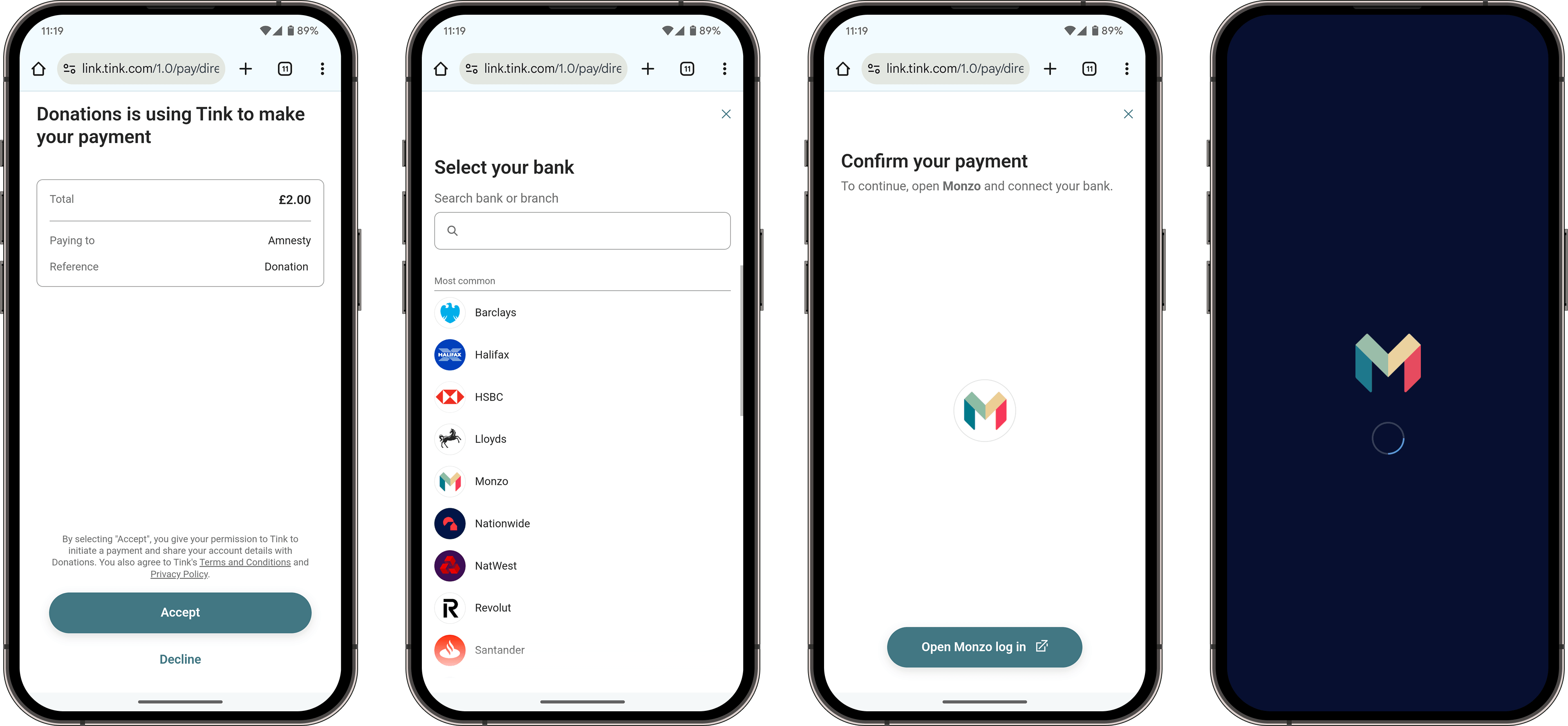
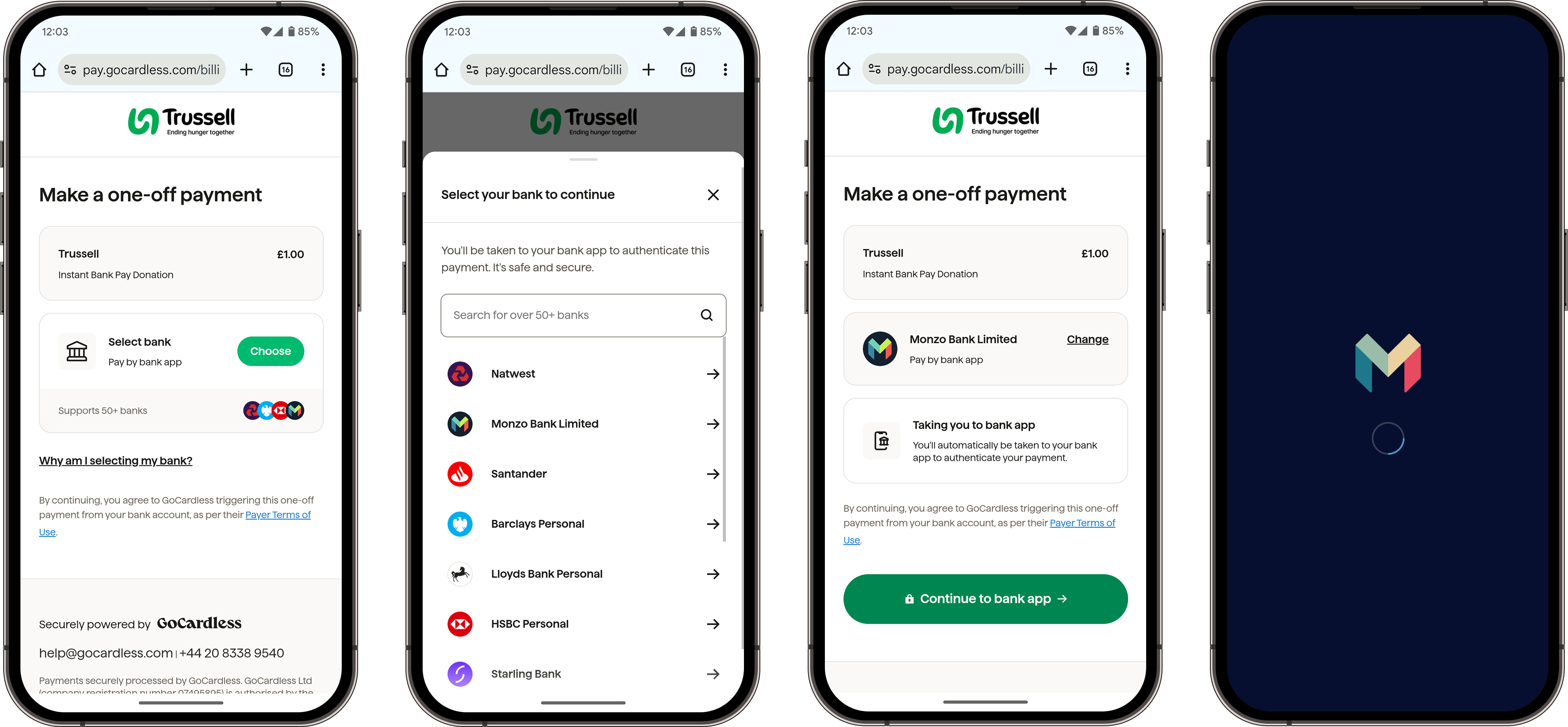
I reviewed the payment flows of several of our competitors to understand how they handled the same moments in the journey:
Payment details: Some displayed the operator and deposit amount on every screen, others didn't.
Handoff to the bank: Some directed the user directly to the bank from a review screen, others had a redirect screen.
This shaped my direction in 2 ways. It confirmed that skipping the redirect screen was a new emerging pattern and it raised the question of whether users actually needed payment details on every screen, which I then tested.
Research: is the payment information actually useful?
The obvious fix for clutter was to remove the payment summary. Before doing that, I wanted evidence. I ran 32 usability sessions with participants in the US, France and Germany, who completed tasks on a prototype and answered post-test interview questions.
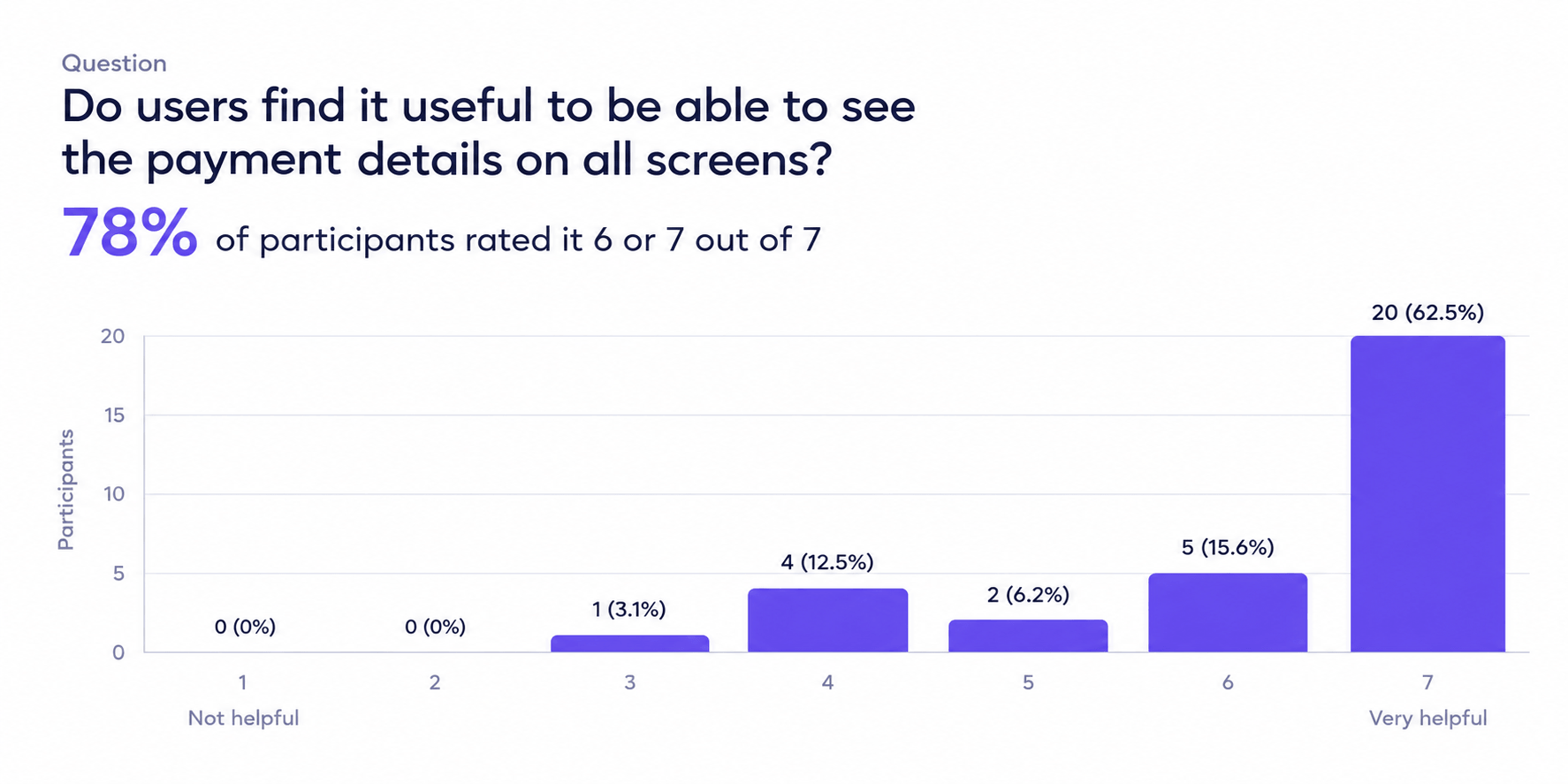
When asked how helpful it was to see payment details on all screens, 25 of 32 participants answered 6 or 7 out of 7. One put it simply:
"It's easy to forget that information, so it helps to be able to see it."
But participants also valued space, especially on the bank selector, where they were scanning a long list. That tension led to the core design idea: keep the details visible by default, and let users collapse them. Participants responded well to this:
"Being able to hide and show gives me a level of control. I like being able to create more space on the bank selector."
"It's a good option to hide it and not force it constantly."
Design iterations: getting the toggle right
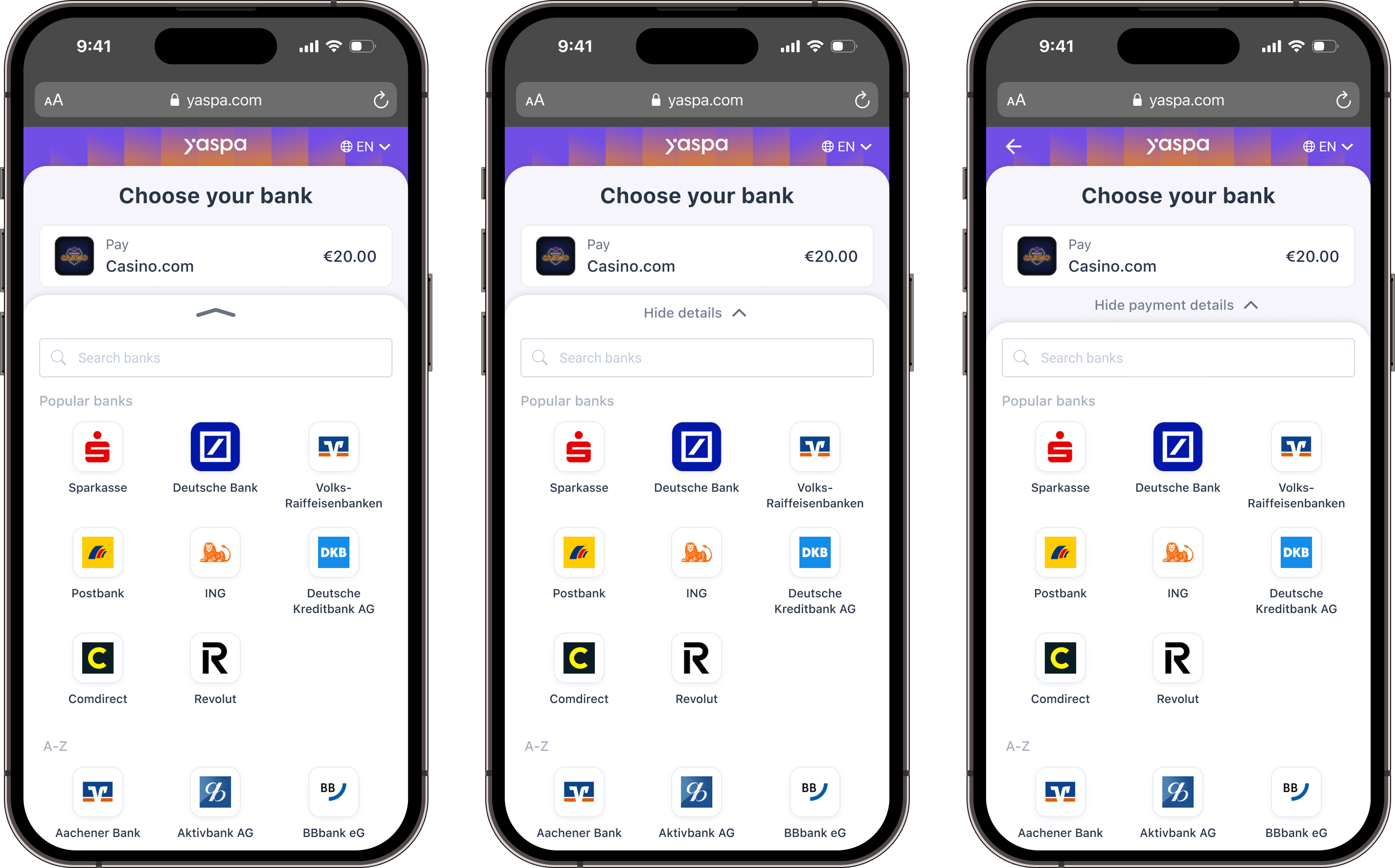
It took three versions of the hide/show control before 5 out of 5 participants could correctly predict what it would do.
The new layout places the bank list in a bottom sheet beneath a collapsible payment summary. A toggle that controls a whole section needs to be unmistakable, so I tested each version by asking participants what they expected "hide" to do, then having them tap it.
Version 1: icon only. A small chevron sat at the top of the bottom sheet. Participants read it as a sheet handle: some expected the sheet to expand to full screen, others expected it to close and reveal more payment methods. The icon alone wasn't descriptive enough.
Version 2: icon and "Hide details". Adding a label helped, but its position still caused confusion. Because the toggle sat inside the bottom sheet, it read as belonging to the bank list, not the payment summary. One participant expected it to hide the popular banks. This is the Gestalt principle of common region at work: elements inside the same container are perceived as a group.
Version 3: icon and "Hide pay details", moved into the summary. I made the label more specific and placed the control closer to the payment summary it affects. Every participant described its behaviour accurately and with confidence before tapping, and confirmed it did what they expected.
The solution
All Yaspa journeys were redesgined using a new visual language with new design patters.
One persistant payment summary: Merchant details and amount appear at the top of every screen in a more considered way, without being repeated on the Review payment screen.
Added moments of delight: The bottomsheet adds a useful and intentional micro-interaction and I worked with an animator to create a success animation for the Payment complete screen.
Refreshed visual language: The bottomsheet component makes better use of screen real estate and gives the flow a more modern, intentional feel while improving the signal to noise ratio.
How users felt about the new design
Participants rated the visual design between 5 and 7 out of 7 across two rounds, describing it as modern, professional and well structured.
"It feels professional. The option to hide/show details is thoughtful. It's not overwhelming."
"All elements are intuitive and easy to understand."
The feedback wasn't all positive, and that was useful too. One participant disliked the "double layers" of the bottom sheet over the header, and another held back a top score because of the colour palette. Unfortunately there isn't much to do around Yaspa brand colours.
What's next
The new flows have just gone live and i'll update this case study with results. We'll measure against the previous design on:
Payment conversion, by country, journey type and product
Drop off on each screen
How users interact with the collapsable/expandable payment details feature
One thing to note was that we weren't able to remove the redirect to bank app screen in this release. That requires changes to where some API calls are made and a back end refactor which we decided was out of scope for this first release.